FARO is an online platform for people at any stage of divorce or separation. In a chaotic time, giving people control and structure, in the form of a step-by-step, interactive process to educate users and guide them through a stress-free system.
The goal was to create a cohesive brand that felt fresh, clean and friendly, which was really important given the theme.
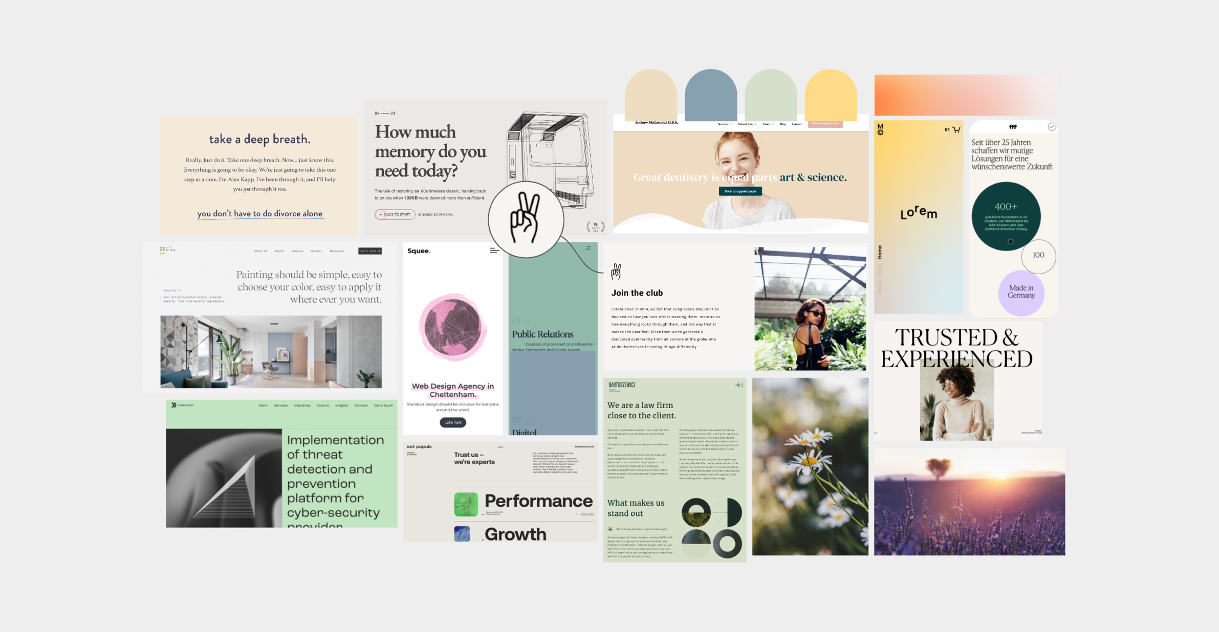
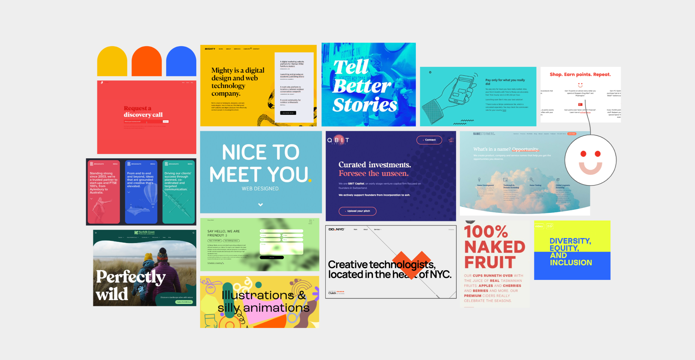
Trust, clarity, guidance & professionalism were just a few of the key words used to describe FARO in the early strategy sessions, so I created 2 pathways from which the client could choose between, Muted or Bold. Both had there strengths and matched well with the brand values - the client ended up choosing the muted pathway, this was perfect as this was also the direction I felt would best suit the brand.
Ideation
Logo
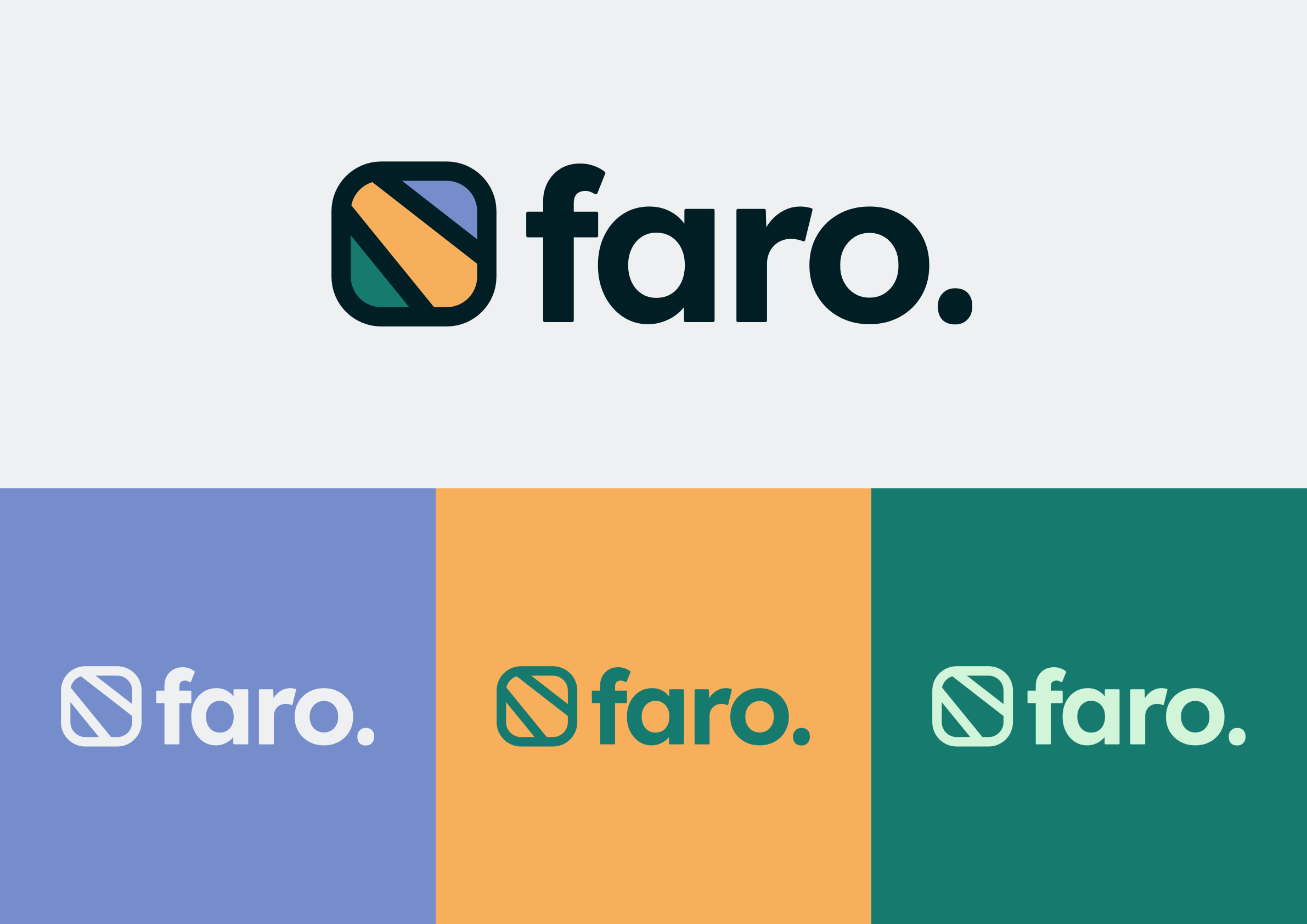
FARO, in many languages around the world, means lighthouse: a structure built to guide ships to safe passage and away from unsafe seas. I wanted this to be factored into the logo design without the use of anything nautical (anti-vision), but with the main message of guidance still being the focal point.
I am really drawn to logo’s which have an abstract feel to them, they are simple in design yet most effective when done right.
FARO’s logo mark (particularly the gold streak in the mark) represents the dual promise of the platform – illuminating users, educating and helping them navigate the passage of this isolating life stage but also showing them the path forward. A life, post-divorce and separation that is made easier because of the guidance and counsel FARO provide.
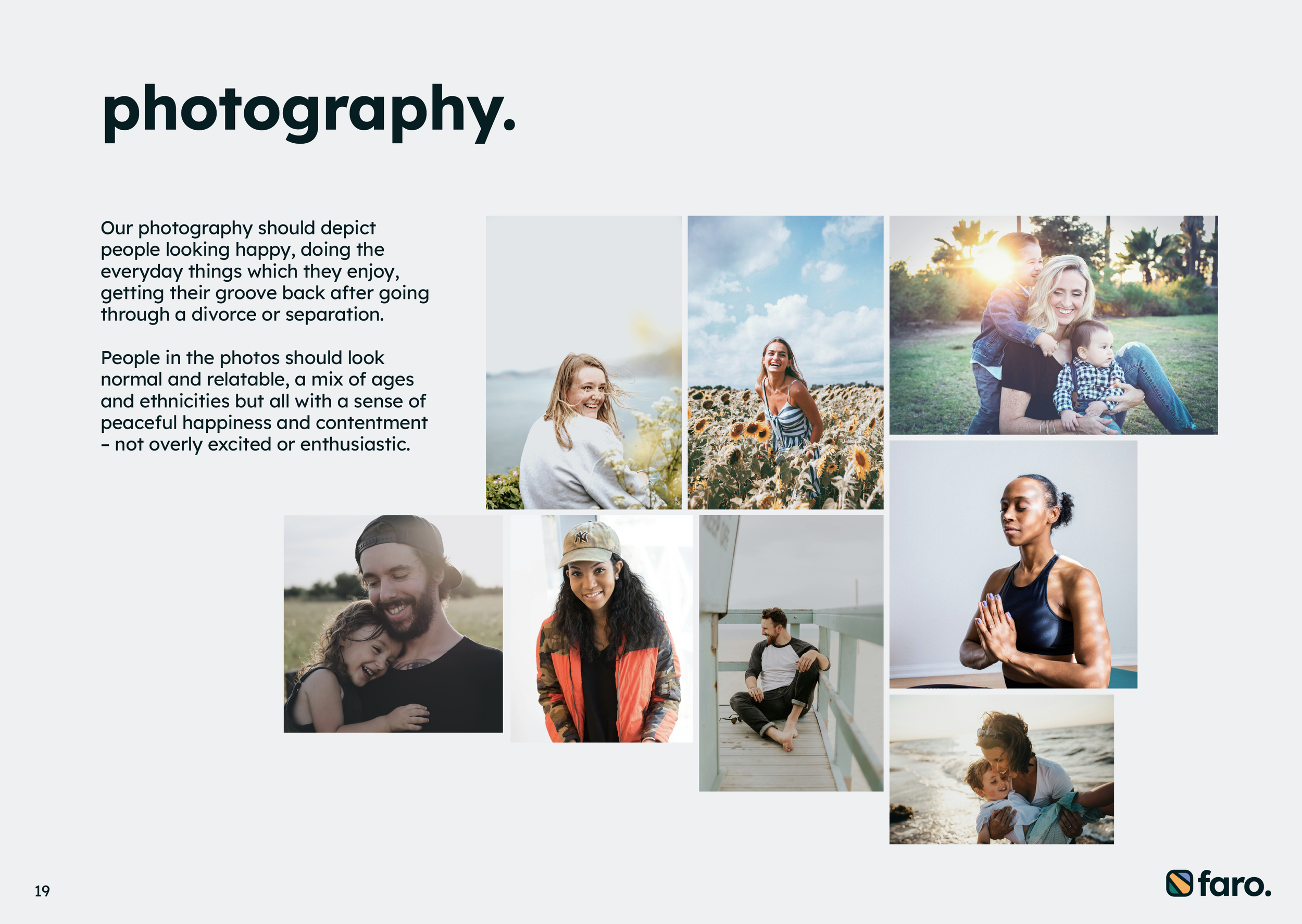
After the concept & ideation stage - and a logo & style direction had been agreed upon, followed an extensive & informative brand book. The book details the do’s & don’ts of the FARO brand - a fresh colour palette & how to use successfully, typography, image guidelines, tone of voice, icons, illustrations + more!
Brand Book
Web
A homepage design was needed to help stylise & set a precedent for the rest of the site. Once the content had been agreed upon, I created a wireframe of the homepage then by bringing in the assets from the brand book I put together a homepage which helped get the message of guidance & support across to the user in a cohesive, friendly & fresh way.


