Aequilibrium is a digital consulting company specialising in VR Training & Digital Banking - partnering with leading Fintech platforms to deliver A1 results.
During my time with AEQ, I played an integral role in bringing vitality to the brand across both digital & print from ideation to creation - AEQ didn’t initially have a strong stand out look or feel, and was in much need of a refresh.
AEQ is built on the idea of balance so I wanted to hone in on this as the basis for the re-design, creating fresh iconography & using shapes to subtly get this point across. Bringing in a vibrant colour palette, fresh gradients, bespoke icons paired with a personable tone of voice - the end result being an identifiable brand which bought excitement to existing/potential clients & reinvigorating the company from the inside-out.
Out with the old & in with the new.
From Social Media & Whitepapers to Brand Guidelines & 1-pagers, everything needed a fresh lick of paint.
Brand Book
After the concept & ideation stage - and a new look had been agreed upon, shortly after followed a new brand book. The book details the do’s & don’ts of the new look & feel - this included an extensive bank of bespoke spot illustrations & icons to be used throughout digital & print, a fresh new colour palette, new gradients, image guidelines, tone of voice & more!
Bringing in the brand spanking new brand colours, bespoke spot illustrations, typography, fresh gradients & a fun tone of voice, a new site was imagined.
Web
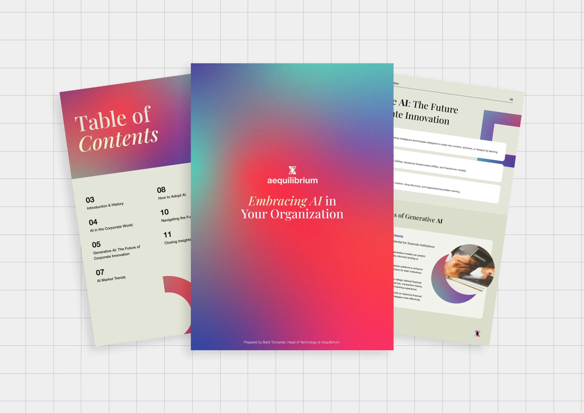
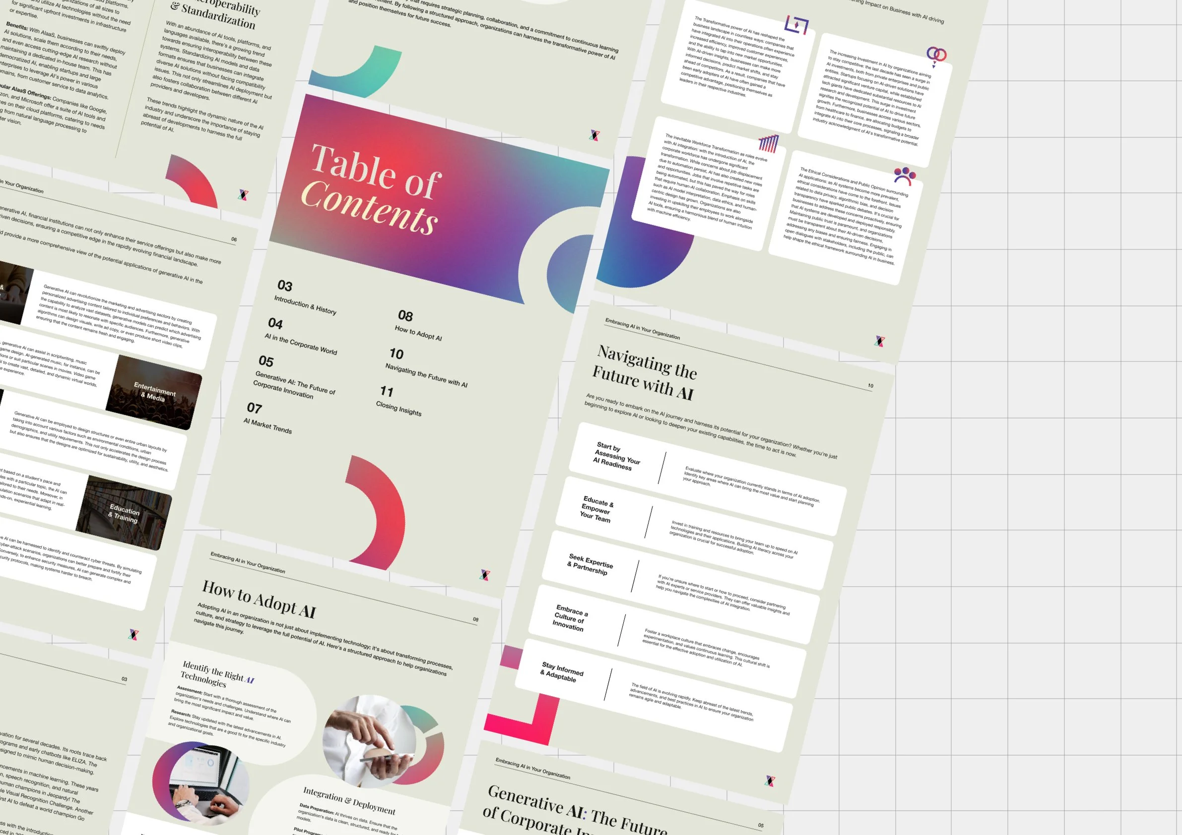
Whitepapers
Applying the new brand look to Whitepapers & 1-pagers. Whitepapers can have a tendency to feel very corporate and cold, so I wanted to make the content pop with the introduction of the new brand details - splashes of gradients, colour and iconography help the content to really shine.


